Wednesday, July 2, 2014

I'm moving but still blogging....

For reasons that aren't likely to be of interest to anyone but me, I won't be adding any new new posts here after today. I thought about closing it to anyone but me, but I realize that there are pins to some of my projects on Pinterest, so I'm leaving this open.

If you are a friend and follower and came here wondering where I am, please visit me at Gigi's Crafts.

Thanks for stopping by, and I hope to see you at my new place.


 photo signature_22.gif

Sunday, June 15, 2014

Dropping in with another card

I don't think I've seen a stamp made by Art Impressions that I didn't like, and thought I was familiar with most of them until I saw 5 sets on Pinterest that are exclusive to Michaels. Visits to two Michaels locations later, I now own 4 of the sets.

The first set I've used is Birthday Airplane Wishes. Friends of mine recently had an anniversary. He is a pilot and they have a Vizsla. If you aren't familiar with that breed, here is a photo of one of the Hungarian hunting dogs.

With that information, can you see why this stamp set was a good choice for making their card? Here is the front:


And here is the inside of the card. My hand written greeting went on the left, the back of the cover.


I used Tombow markers and water to create a sky background on Bristol paper. I stamped the images, then scanned them and slightly enlarged them for easier coloring with Copic markers. The images were fussy cut and glued to the sky background. The lettering was done in Word. The cover greeting used Stampin Up punches, the arced lettering of Happy Anniversary was done using Word's word art and the banner was cut free hand.

If you are wondering about these sets, here are ones that I have seen at Michaels:


Wednesday, June 11, 2014

Graduation Cards

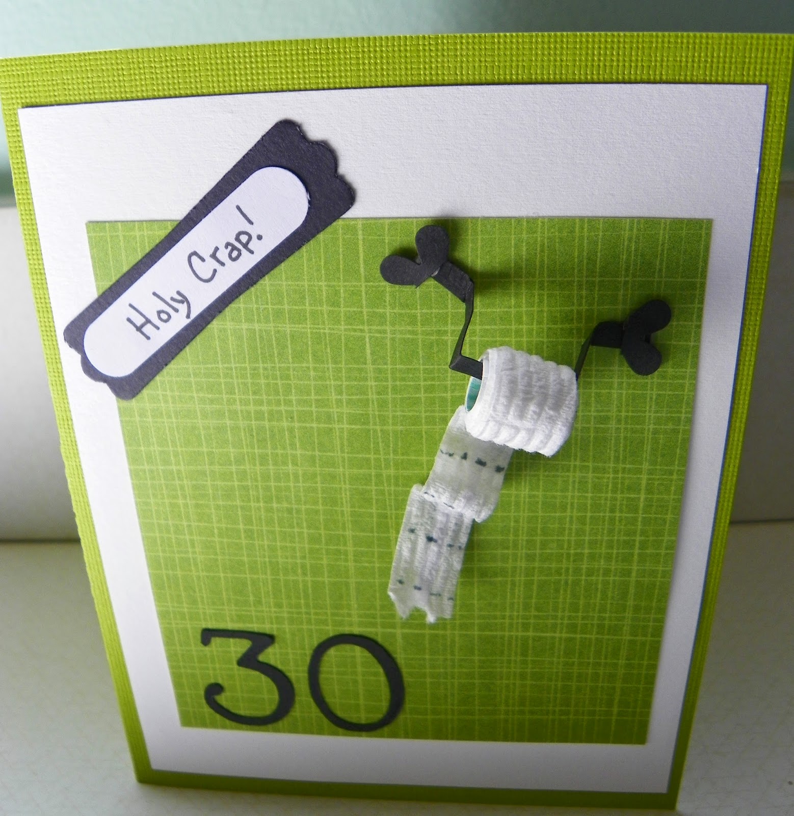
The cost of two graduation cards at a Hallmark store could be $10. The cost of two handmade graduation cards could be $368.21. 

That was just a joke, but one we often repeat in this house. Just yesterday I went to the local scrapbook store for one, only ONE, sheet of paper and spent $27.  I am good for the crafting economy.

My point is, I don't make cards to save money nor do I make gifts of any other manner to order to save cash. I certainly don't do any of this to save time. I make the things I do because they make me happy and hopefully the recipient is pleased that I took time and thought of them during the process. When they are happy about that, it sweetens my pleasure.

We have two high school graduation parties coming up. This first card is for a neighbor's son. I followed instructions given here with the only change being and additional layer of card stock. The black was cut to the original dimensions, the white layers a 1/4" smaller on all sides.


The yellow paper shows where cash or a check will be inserted. The tassel was made from red and white embroidery floss. Today I will attempt to make an envelope for this, perhaps just a large square one. The card will be hand delivered, so I'm not terribly worried about creating an envelope.

The next card is for a girl I've known since her birth.  I have enjoyed making "card in a box" greetings before and this time decided to try a rectangular rather than square card. The directions for the square card in a box (or pop up box card) are here and examples of cards that I've made following that pattern are here and here.

The directions for the rectangular version (found here) and while my card will fold flat, I didn't keep in mind the height of my add-ins. The idea of these box cards is that when folded flat, they look like a box and you don't see the photos and embellishments inside that pop out. Oh well. I think the graduate is going to like the card anyway.

A shot from above the card

A photo at eye level


From the side you see a bit of what is going on inside. There are two strips of paper added in the middle of the box. The photos and twirly ribbons are glued to those strips, staggering their depth within the box.


And here is the back. I added another piece of red paper to the back with the half circle cut out at the top. That is glued on the sides and bottom only. There is a piece of white paper stuck inside to show where the cash or check will go. Guess I should have used yellow again since it blends in with the back of a photo. I will write our personal greetings to the grad and fold that paper over the cash or check before it goes into this pocket, maybe with a ribbon pull tie on the edge of the paper.


The twirly ribbons are stickers on acetate. The stickers adhered to the acetate but neither glue, glue dots, nor double sided tape would stick to the clear acetate. I used my smallest stapler to add a square of paper to the bottom of each acetate strip, then glued that to the paper inside the box. I'm using acetate as a general term, I don't know if this is technically acetate. What I cut up for this was a sheet of clear plastic that came with cling stamps that are no longer stored in their original packages.

Thursday, May 15, 2014

More Cards!

I've had a lot of fun the past two days making cards after watching online tutorials.

The first card is explained in detail here by Stacey at Scrapbooking Simple. I used the same supplies Stacey used, ordered from her store. I haven't seen the stickers in stores near me, but liked them so much, I will be ordering more and looking for them locally.

I won't describe in the detail that Stacey does because she covers it so well in her YouTube demo and I don't want to step on any copyright toes, should that be a factor.

Materials used were

Sookwang tape
Elizabeth Craft Designs peel off (vinyl) sticker  #2559
Elizabeth Craft Designs silk microfine glitter
Zig Brushables markers

This was super easy and I think the result is stunning. The YouTube video is long, but please consider watching the part that explains how to accomplish this. She begins explaining how to use the products at the 7:30 mark, and gets into how to add glitter and then color at 12:00.


I cut this oval free handed, than added it cardstock cut with Nestabililities Labels Four S4-190 Die. The green paper was a scrap, cut on the long sides with a Martha Stewart punch.


The photos don't do this justice. The colors and sparkle (without screaming GLITTER) are beautiful.


The next card is my first slider. I followed this  Slider card tutorial . I think the only dimension that Julie doesn't give is for the strip of paper on the front that covers the slider opening. I cut mine (the print on white background at the bottom) roughly 1 3/4" x 6". The only change from her instructions is that I oriented my slider to go to the right instead of left.


I used the same paper to hide the working part of the slider on the inside. All I have left is to decide on an inside greeting.


This was a little bit of work but not difficult. I know the recipient will be happy with it which is all that matters. That and the fun I had making it.

I will definitely use both of these techniques again.

Saturday, May 10, 2014

Holy Crap! a birthday card

The idea for the toilet paper came from Pinterest on a card that was a photo only, no link provided to credit the original card maker.


I cut a narrow strip of lightweight paper to make the core of the toilet paper roll. Next I cut a strip of actual toilet paper, adhered one end to the core and began rolling. I used small glue dots to hold the free hanging paper to the remainder of the roll and in two spots onto the card. There is a narrow strip of lightweight paper under the free hanging paper to provide body and have it holds its wave. The lines were done with a Copic multiliner.

The holder is a strip of black paper. I used pieces from a floral punch to cut the doodads for the brackets that would hold the dispenser to the wall. This is a better view of the holder.


The "Holy Crap!" punches are both from Stampin' Up. The "30" is Doodletype font, cut with a Cricut.

Use your imagination as to what else could be said rather than Holy Crap. 
I will make this again. The only drawback is that it isn't a card to be mailed. I didn't even attempt an envelope for this.

Friday, May 9, 2014

Too stupid or too smart?

Have you watched a TV show, gone to a movie, seen a play or read a book that has won awards or received much critical acclaim and nominations, only to wonder what others saw that you didn't?

It would be dull if everyone liked the same things, so that isn't the issue. You couldn't pay me to watch Duck Dynasty, but leave me alone if I'm watching an episode of The Big Bang Theory that I haven't seen before.

I recently read The Devil in the White City by Erik Larson, (  Click here for Amazon description ) but not because it had accumulated a list of honors. A friend asked me to read it so we could discuss it. I didn't dislike it, but I can't really recommend it either. For me, it seemed the author couldn't decide if this should a non-fiction history of the 1893 World's Fair in Chicago, or a fictional murder mystery based on fact. It was too heavy on detail for the former and lacked closure on the latter, but that is only my opinion. I did learn a few interesting facts along the way.

The bigger the award, the more hype a novel or play will receive, understandably so. Last night I saw the play August: Osage County. I had not seen the movie, read a synopsis or any reviews. A friend picked this for our evening out.

I won't give any details that could spoil viewing the play or movie. All I will say is that it was 3.5 hours that felt like a mere 7 or 8. I can take black comedy. I can take swearing. I can take a sad drama. What I can't take is not caring about any character. Not one, not at all. There wasn't a redeeming quality to any of them. Did I mention this lasted 3.5 hours? The swearing was profuse, mostly the F-bomb and its variations, but even the C word was used. That one made me cringe. I hate that word. I don't know what other dramas were in the running in 2008 when this won a Pulitzer, but I do wonder what the panel saw that I did not.

I've read that an author, editor or publishing house can buy their way onto prestigious best seller's lists. A restaurant can claim they were voted as having The Best Burgers!!! without revealing that the voting panel was made of friends and relatives who have invested in the business. I know I am sounding cynical but truly, prizes and claims of excellence might lead me to try something because it caught my attention, but I'm not falling for anything. I like what I like and expect you feel the same way.

How do you feel when something with critical acclaim gets a so-so or failing mark on your personal grading system? I once thought that my friends and I were too stupid to see what the critics were raving about, but now I think maybe we are too smart to swallow the hype.


Wednesday, April 30, 2014

Snarky and colorful nature

I can't believe today is the last day of April. I think part of my denial is that expectation would have the weather much nicer than it has been. The forecasters continue to try to pinpoint when precipitation will hit and how much. My prediction is much more accurate: The forecasters will be wrong!

I think Mother Nature is snarky, don't you? I'm not picking on her, I identify with her. Sometimes I do things just to prove someone wrong, usually when they are smug sure of themselves. I have an acquaintance who is becoming increasingly annoying with finishing other people's sentences. Since this takes place in a setting where I don't feel like confronting her, I usually overlook it but every once in a while I change what I was about to say when she interrupts. This is a hypothetical example of what I do when she gets to be too much:

Me:  I bought a new pink dress to wear to the event and did my hair
Her: (interrupting) held back with the silvery clips you like so much
Me: No, I dyed my hair with grape Kool Aid and looked fabulous

Don't you just love Dame Edna?
Mother Nature, when feeling snarky, hears the forecast and sends the opposite, just to prove expense equipment is no match for her power. Speaking of Mother Nature and her need to be right, who is old enough to remember the Chiffon margarine commercials?


The ads ran through most of the '70s, Chiffon was discontinued in the early 80's. 

I'm not fooling Mother Nature, but I am having fun depicting nature. I had another pair of classes last Saturday, one featuring Copic markers and a new technique, the other class was a combination of markers and Prismacolor pencils. Here is a tree top:


Same technique, same colors on a different tree top. The trunk was die cut, using Memory Box's "Grand Willow Tree"


The second class featured stamps from Penny Black's "Garden Friends" collection. They were scanned and enlarged before printing them to color. I didn't like the mouth on the bunny on the left so I didn't repeat that on the right. The only other difference between the two samples is that I didn't add a drop shadow to the images on the right.


I'm a sucker for ladybugs. Red ladybugs, not the invasive orange ones that aren't true ladybugs and are a problem in some areas.


Colorfully yours (and wishing for warmer, drier weather),
 photo signature_12_zpsae09ea52.gif

Friday, April 18, 2014

Anniversary card

Good friends of ours are celebrating their 45th anniversary. Isn't it nice to hear of couples being together that long?

They have a good sense of humor so making them a card with these characters from Art Impressions won't be insulting. I had the idea of having Edna (stamp #1241) outside and Oscar (#1239) indoors for a number of reasons, one being that our friends have just returned to Michigan from Florida. Our "Edna" is happy to be outside in our current weather, but "Oscar" is likely to be huddling inside near a space heater, waiting for the temps to hit at least the upper 70s.  I used the stamp called Curtain Window (#4234) to make the window for them to see each other while being apart.


I stamped the characters and window images onto plain paper, scanned them, enlarged them slightly and printed them on paper that was suitable for coloring with Copic Markers. The paper I used was Bella's Best Paper by Stamping Bella.

I cut white cardstock in 8.5 x 5.25 pieces, scored them halfway, and glued them together to make 4 white pages. I cut a sheet of yellow cardstock to make the outside cover for the card.


I used a variety of Copic colors on the images, then fussy cut them and glued them in place. I played around with placement to figure out where the window would go so that his head could be seen while the pages with Edna were being viewed, and hers would be seen while looking at Oscar. I used a variety of adhesives, Xyron, a tape runner, and Sookwang tape, guessing at what would work best for each application.


The words were done by computer and cut with Stampin' Up punches. The scalloped oval punch is also from Stampin' Up.  The flowers were doodled, colored, cut and glued into place when I decided that blank spot needed something.


I wanted the front of the card to be simple. Before gluing the yellow cover in place, I used an edge punch to make the scalloped edge. The Happy Anniversary greeting was done on the computer and printed on a yellow and white background that doesn't show up well here. I used Spellbinders Nestabilities Labels Four (#S4-190) on a Sizzix Big Shot to create the medallion. After deciding the first view needed something, I outlined each layer with a fine tipped black liner pen. See the hiccup? It was too late to start all over. Darn it. Oh well. 


I haven't heard from the anniversary couple yet, but I'm pretty sure they are going to enjoy the card. I had a lot of fun making it.

Monday, April 14, 2014

Mother Nature, happy birthdays and Minions!

There is no 800 number to call Mother Nature and complain about the weather she delivers. Doesn't matter. If there was a compliant hot line it would be down due to overload anyway. The midwest already has snow on the ground and we're expecting an inch overnight. Is it coincidence that unwanted snow is due to appear on April 15th, the day so many hate because of the IRS?


Birthday happiness continued this weekend for my relatives. The young man who received the bottle of cash (see previous post) was thrilled with his gifts from everyone, including clothing. Not many boys at the age of 9 are happy with clothes, but this young man was. He was also happy to get a small yard (leaf) blower. Not a toy, a real one. And the gift that almost brought tears to his eyes was a Kindle Fire. After opening all of his guests, he proclaimed this year as his "Golden Birthday" because it was the best ever. Wasn't that sweet and also wonderful?


Lastly for today, do you know who Minions are? You do if you are a fan of Despicable Me and Despicable Me 2. I love the Minions. Make that I LOVE the Minions! Here they are as seen in the movies:


There are lots of them with many different personalities, all with one or two eyes behind some form of goggles. If you are a fan of them and follow Pinterest, you will have seen edible versions made of Twinkies and cookies, clay and paper renditions, and appropriate for this time of year, Minions made from eggs. Some use dyed hard boiled eggs, others use plastic eggs, which is what I did.

Many sites suggesting using black electrical tape for the goggle band. Cutting a piece thin but even wasn't easy so I used a Sharpie marker. I had a silver Sharpie that I used before the googly eyes were glued on with glue dots. I experimented on a green egg first to make sure the marker wouldn't smear. The purple egg was also an experiment. In Despicable Me 2, most of the Minions are turned into hairy purple beasts for a brief spell. A smooth purple egg just didn't work for this. That's ok. He can be a Minion with a skin condition. 


I goofed on the guy with the three eyes too. He isn't an official Minion. He is a Minion wannabee. Now if they would only work for me the way the movie Minions work for Gru, I'd be ecstatic. I'm pretty happy anyway because when my grandson saw them, this conversation followed:

Colton: "Hey! Where did you get these guys?"
Me: "I made them."
Colton: "You made them? Wow!"